


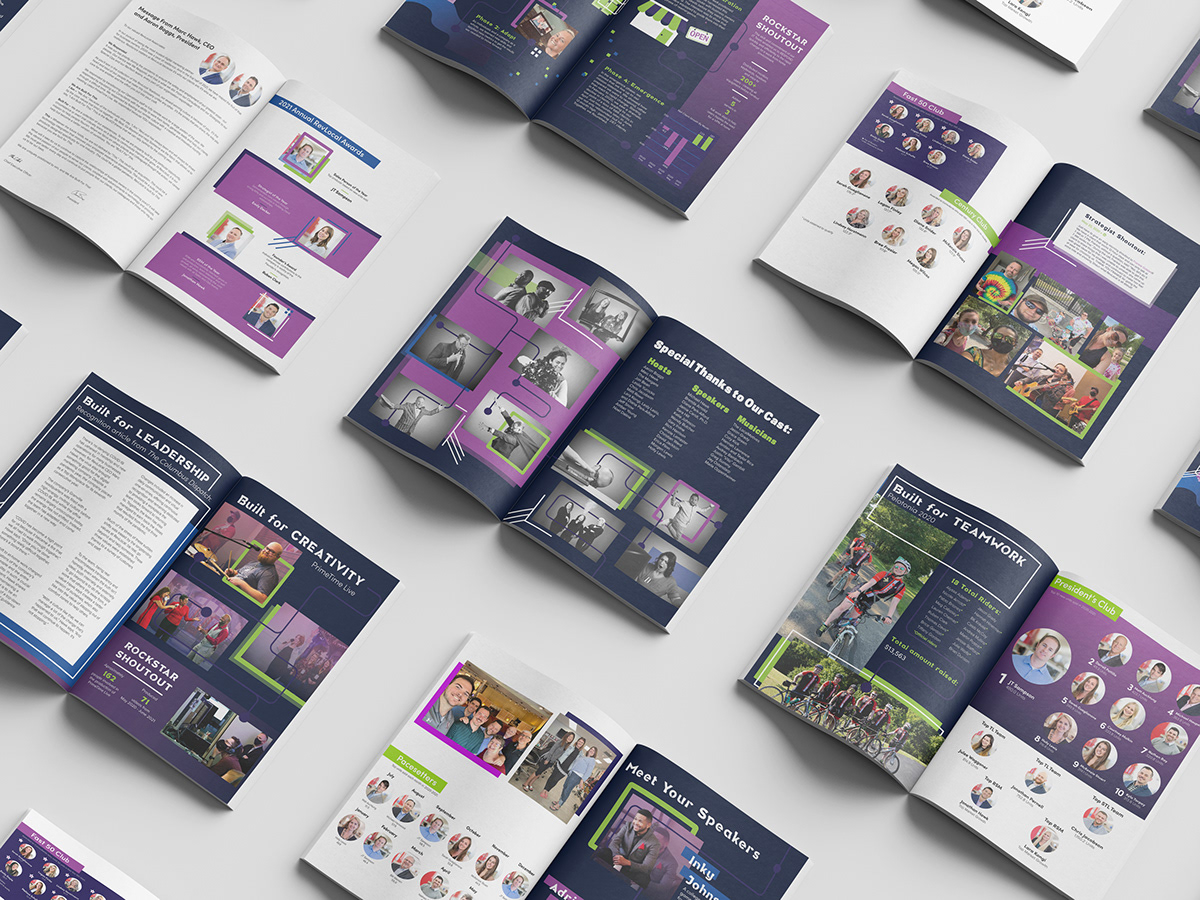
For RevLocal's annual Company Meeting -- a mix between an expo and a theatrical production -- it was always tradition to distribute what we called the Rockstar Book. In short, the Rockstar Book was a physical copy of RevLocal award winners, with a heavy emphasis on the success of our sales people.
Well, working in Operations, I felt somewhat excluded from the book. Though there was a lot of pride in seeing individuals flourish, I knew we could take it a step further. I heard people say they're not interested in taking a book because they're not featured in it. So, I wanted to revamp the Rockstar books before the Company Meeting coming up. My main goal was to provide value for everyone, not just those making lots of sales or featured within the book.
I conceptualized this project as a way of featuring all of the accomplishments we have had as a company over the past year. The concept was supposed to mirror the purpose of a yearbook -- featuring main events throughout the past year: company development, our non-profit initiatives, WIGs, sales goals, and product launches. I knew this had the potential to increase the sense of comradery and team spirit that comes with Company Meeting.
I started by contacting everyone within RevLocal who I knew would have the statistics, photos, and anecdotes I needed to accomplish my goal. I wanted the process to be collaborative, because everyone had expertise outside of my own. While I waited on getting the information I needed, I brainstormed and created wireframes to prepare me to dump the content into place.
As far as design goes, I went with design that was consistent with the techy aesthetic we had already branded for Company Meeting. This included stacked boxes, geometric shapes, and circuit board imagery. I then used these elements to create depth within the design and layouts. For example, I wove the circuit board imagery around some of the people subjects in the photos. Doing this allowed me to not only reinforce the branding, but also create depth and interest value by making the subjects of the photo interact with the graphical elements. I also use some of the blocks as frames to the photos and the white accent lines to accomplish a similar effect. The white lines also served to show movement and keep the eye moving across the page so that the pages were more dynamic.
Overall, the final product accomplishes both the practical goal of the vision I set out to execute. Both visually and through subject matter, it provides the value that I made a point to incorporate upon starting the project.


